Form+Forge
An identity for a construction and interior design company.
WHAT WE DID
Branding,
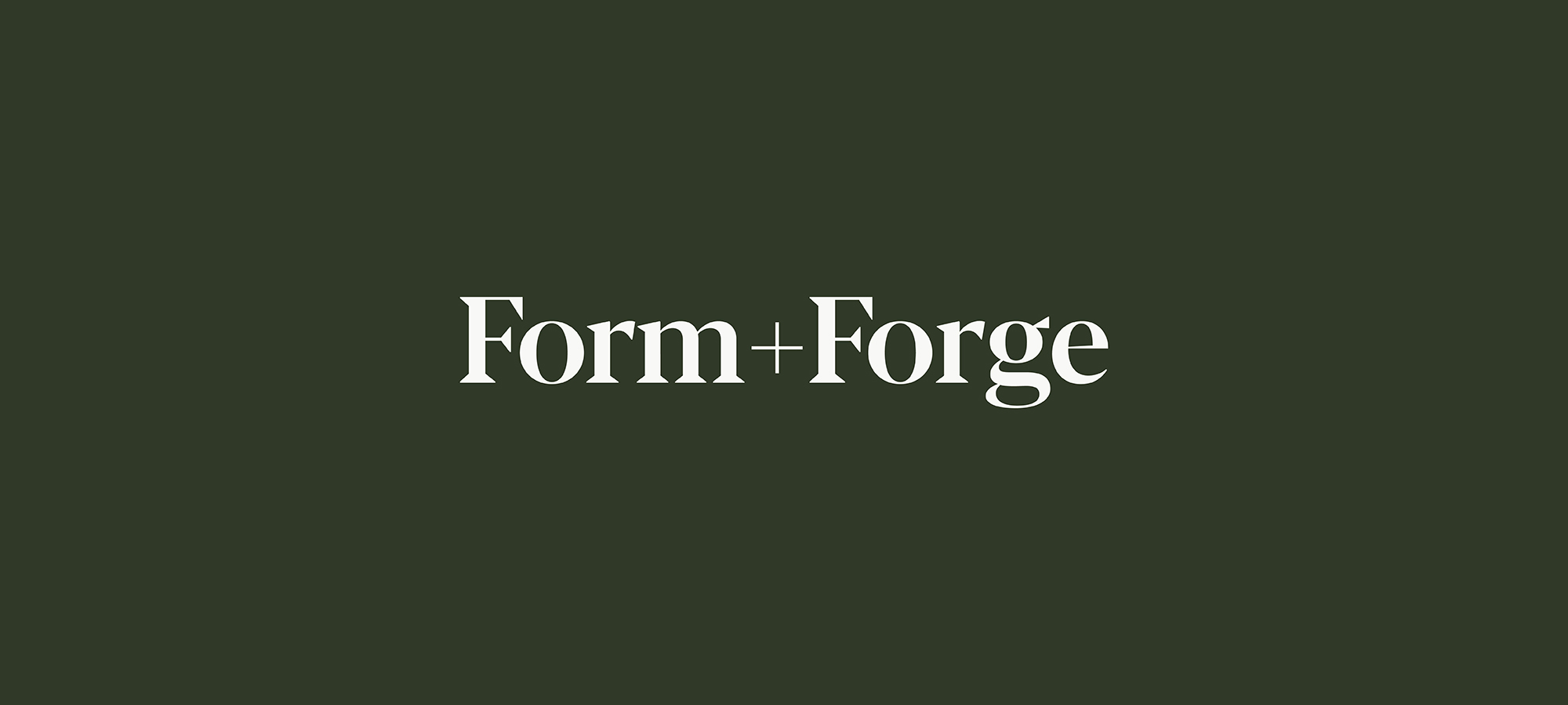


WHAT WE DID